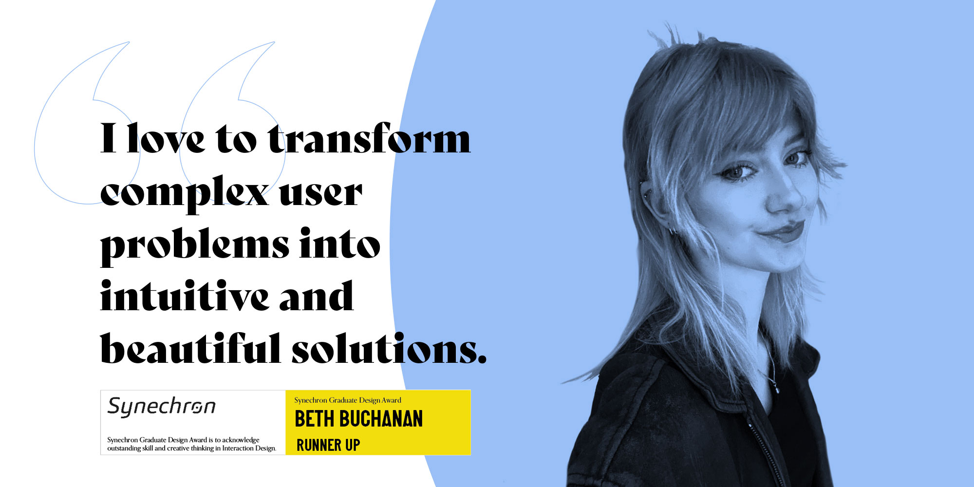

My name’s Beth, I’m a UX/UI designer based in Belfast, Northern Ireland. I believe that in our tech-driven world, everyone should have an equal opportunity to not only use technology but also enjoy how it looks along the way.
I’m currently a product designer at Instil, a software engineering company with an incredible team of talented designers and developers, feel free to follow my progress on my socials.
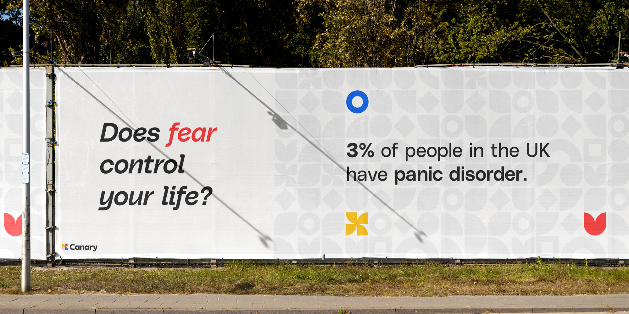
Canary is a multi-device app aimed to help people suffering from agoraphobia (an anxiety disorder that causes people to become fearful to leave the house, or go to specific places alone). Agoraphobia has many different causes, and so this made my research scope vary broad, however I was able to break it down to design for two user groups - agoraphobia with, and without panic disorder.
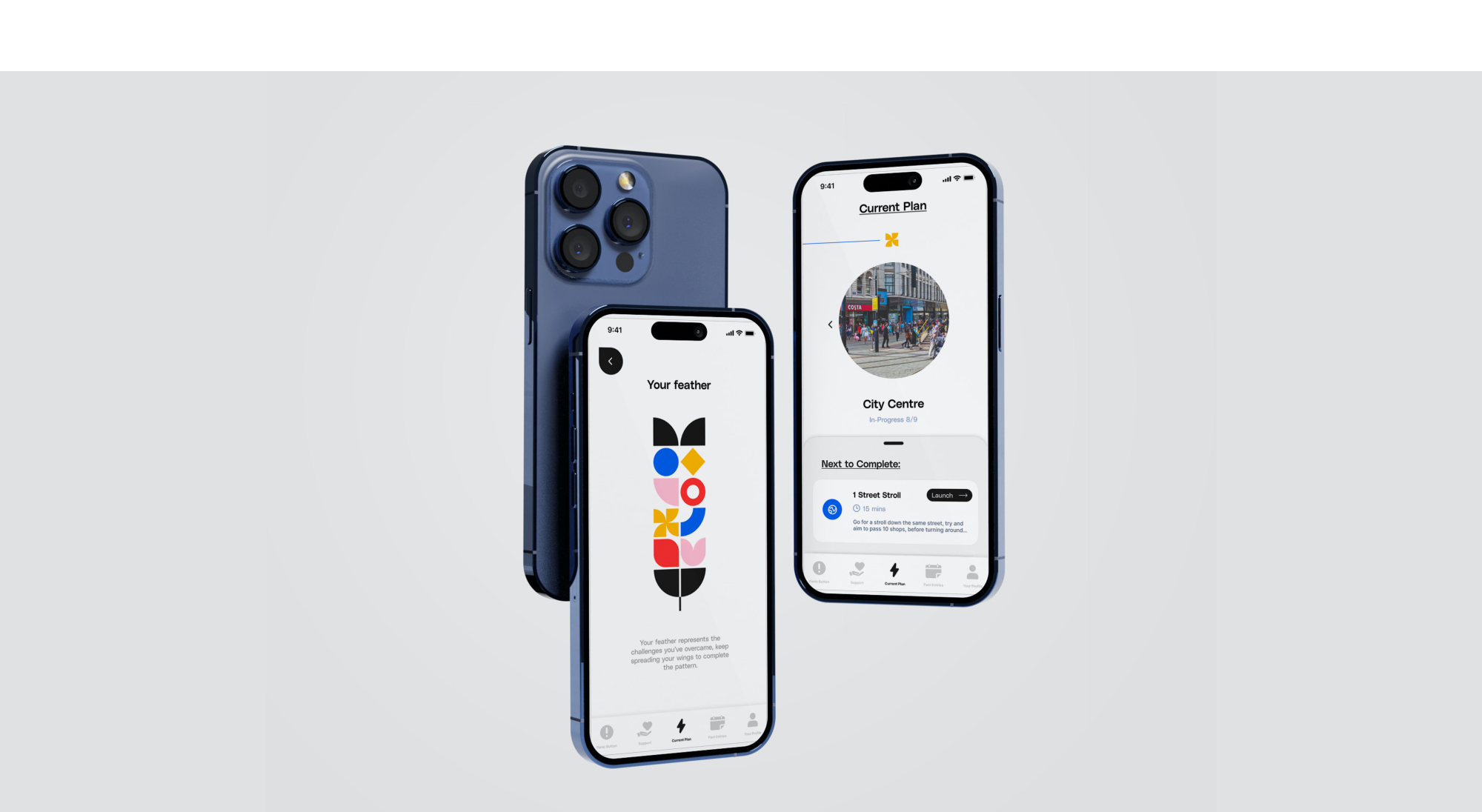
Canary aims to help patients complete exposure therapy, and gradually introduce them to triggering environments in small, bite-sized steps (via audio, image, video, and VR exposures). It will also track heart rate throughout, and quiz patients on how their exposures went before allowing them to progress - therefore easing panic attacks, as well as helping better communication with their therapist between therapy appointments.
To start, I conducted user interviews, surveys, and did a lot of desk research surrounding panic disorder and agoraphobia. These helped me validate the need for my product, as well as get to the bottom of why people weren't attending exposure therapy, and if they had attended it - what they wish they could have changed. Interviews in particular, as well as asking open-ended questions in my surveys were a great way of gathering ideas for potential features.
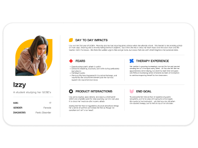
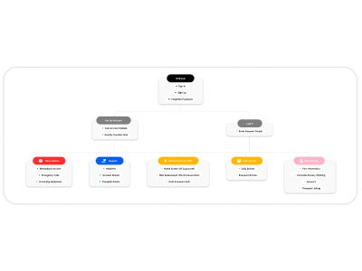
After a few rounds of feature brainstorming, I used journey maps, empathy maps, and user personas to help me empathise with how the patient might be feeling as they use the Canary features. It also helped me to understand the paths they'll take to complete exposures both in and outside the app, as well as the variety of different anxiety sufferers needs and how they differ. Understanding their perspective in this way allowed me to refine features, eventually leading me to creating a site-map, user flows, and wireframes.

I created a lo-fi prototype of the Canary mobile app in order to set up A/B tests as well as plan my content and journeys. After this, I moved onto mid-fi (the purpose of this was to work out sizing and layout of my content), before finally applying my branding and creating a design system to ensure visual consistency.
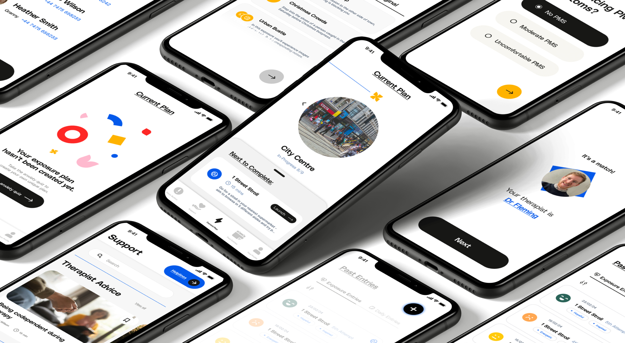
Working on Canary has been a challenging but incredibly rewarding experience. I had the opportunity to grow my skillset, as well as showcase everything I’ve learned over the past four years. It’s a lesson I’ll take with me into my future endeavours, helping me approach them with greater confidence and resilience. I’m really happy that I can look back on the work I’ve produced this year, and say I’m proud of the result.
The Hi-Fi mobile prototype for Canary is linked below, as well as my research blog containing all of my process work.
